Rob Martin, the new Senior UI Designer at Carbine Studious wrote interesting article on official page about WildStar User Interface changes. He compared UI design that once was, one that is available right now and how feedback from players helped move it in the right direction towards the final version.
In his article Martin said that development team was looking to improve these two things:
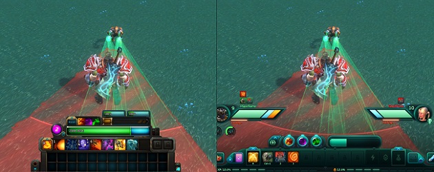
- “Using the Engineer as our current “worst case scenario”, in the image above you’ll notice with two secondary action bars in use, the Engineer’s play space is covered by UI that takes up 26% of the screen from the bottom. This almost always required zooming the camera out in order improve combat mobility.”
- “We also received a lot of feedback that information about your target (at the top of the above image) felt too disconnected from where you were usually looking during combat (typically around your characters feet).”
That’s why they decided to “flatten” the interface and split it in additional hotbars, giving better view to the player.
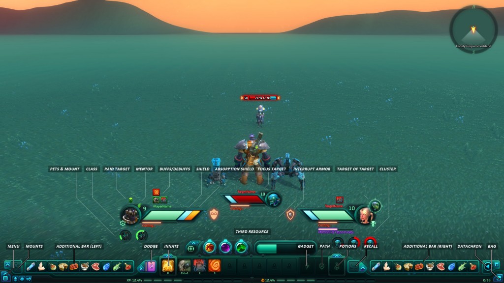
The biggest change is, however, ability to move windows and turn them on and off in a way that best suits you! You can find the new WildStar User Interface explained on the pic bellow, but for the more info you can visit original article here.